Design · September 15, 2024
How to Design CTA Buttons: UX Best Practices
By Anika Sarder · Digital Marketing Specialist

Introduction: The Critical Role of CTA Buttons
In the vast digital landscape, CTA (Call to Action) buttons are pivotal elements that guide users towards desired actions, from signing up for a newsletter to purchasing a product. These buttons not only cap off user journeys but significantly impact conversion rates and overall user experience. A well-designed CTA button can turn a passive browser into an active participant, making it a cornerstone of successful digital interfaces. By optimizing these buttons for visibility, readability, and clickability, businesses can effectively streamline their user flow, leading to increased engagement and higher revenue generation. Additionally, strategically placing these buttons in intuitive locations can leverage natural user behaviors, further enhancing usability and improving the effectiveness of digital strategies across platforms. Effective CTA design not only appeals aesthetically but also aligns with the psychological triggers of the target audience, ensuring that each button is a stepping stone towards achieving business objectives. Incorporating feedback loops and analytics into CTA strategy allows for continuous improvement based on actual user interactions, making each iteration more aligned with user preferences and business goals.
Design Fundamentals of CTA Buttons
Size and Shape: Balancing Visibility with Design Aesthetics
The size and shape of a CTA button play a critical role in its effectiveness. A button must be large enough to be easily clickable yet balanced enough not to overwhelm the rest of the design. Common shapes include rectangles with rounded corners, which are perceived as more friendly and approachable than sharp-edged rectangles. The key is to maintain sufficient padding around the text to ensure legibility and tap-friendliness, especially on mobile devices. Additionally, the contrast between the button color and its background is crucial in drawing attention while maintaining aesthetic harmony with the overall website or app design. Optimal button design also considers the visual hierarchy, ensuring that the CTA stands out as a focal point without conflicting with other important elements on the page. This balance helps to guide the user’s eye naturally towards the button, encouraging interaction without forcing it, and supports a seamless user journey from initial interest to final action. Moreover, the tactile feedback on click or touch, often overlooked, can significantly enhance user satisfaction and perceived responsiveness, further improving engagement and conversion rates.
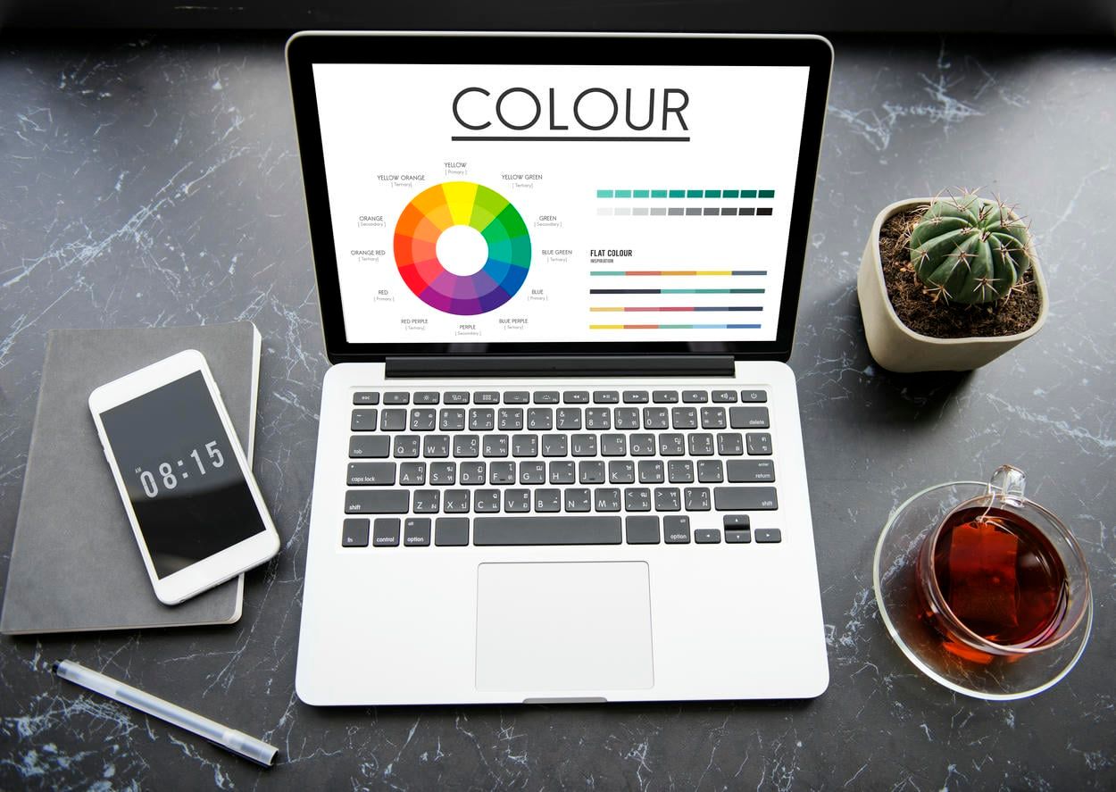
Color: More Than Just Aesthetic Choice
[](Color: More Than Just Aesthetic Choice )Color is a powerful tool in CTA design, capable of invoking specific emotions and actions. For instance, red can create a sense of urgency, while blue can instill trust and security. The color should stand out against the background but also fit harmoniously within the overall color scheme of the site. Importantly, it’s essential to ensure that the button color is accessible to all users, including those with visual impairments. To achieve this, designers must consider color contrast ratios that comply with accessibility guidelines such as WCAG (Web Content Accessibility Guidelines). Furthermore, experimenting with different shades or gradients can enhance visual appeal without sacrificing functionality, making the CTA not only more noticeable but also more engaging for users. Additionally, using psychological principles, such as the color theory, can help tailor the emotional impact of a button to match the intended action, ensuring that the CTA resonates with the target audience’s expectations and drives the desired behavior. Moreover, the strategic use of color can also guide users’ attention to secondary actions without detracting from the primary button, effectively managing the visual hierarchy and user flow within the interface.
Placement: Strategic Positioning for Optimal Impact
The placement of a CTA button should follow the natural reading flow of the page—typically, ‘above the fold’ to catch the user’s eye without scrolling. It’s also crucial to position CTAs in logical places that align with the user’s journey, ensuring they appear at a moment when the user is most likely to take action. This strategic placement can capitalize on the peak of user engagement, such as after a compelling product description or a persuasive testimonial. Additionally, considering the spacing and proximity to other interactive elements can prevent user confusion and help the CTA stand out as a clear call to action, reducing decision fatigue and enhancing the overall user experience. Moreover, in multi-step processes, such as forms or checkout flows, intelligently positioning CTAs can guide users smoothly from one step to the next, maintaining momentum and preventing drop-offs. Furthermore, testing different placements using heatmaps or A/B testing can provide insights into how users interact with the page, allowing designers to optimize the CTA location based on empirical data, thus maximizing the potential for conversion. Additionally, placing CTAs in consistent locations across a site can reinforce user learning and behavior, leading to quicker and more confident actions, as users become accustomed to the site’s layout and navigational cues.
The Psychology Behind Effective CTA Buttons
Action-Oriented Language: Encouraging User Engagement
CTA buttons should use concise, action-oriented language that clearly states what will happen next. Phrases like “Get Started,” “Learn More,” or “Join Us” directly invite user interaction. This active language helps reduce hesitation and propels the user towards taking immediate action. Additionally, personalizing the language to align with the user’s needs or desires, such as “Claim Your Free Trial” or “See Your Recommendations,” can increase the relevance and effectiveness of the CTA. This tailored approach can make the call to action feel more engaging and specifically suited to individual users, thereby enhancing the likelihood of a positive response. Moreover, integrating verbs that suggest immediate benefit, like “Discover,” “Unlock,” or “Access,” can further motivate users by clearly indicating the value they will gain by clicking the button, thus driving higher engagement and conversions. Crafting CTAs with these powerful verbs not only enhances clarity but also injects a sense of urgency, encouraging users to act quickly to reap the benefits outlined. Employing positive, action-driven language also establishes a proactive atmosphere that can make the digital experience more dynamic and rewarding for the user.

Creating Urgency: The Now or Never Approach
Incorporating elements of urgency or scarcity, such as “Limited Offer” or “Only a Few Left,” can significantly enhance the effectiveness of CTA buttons. This strategy plays on the human tendency to respond to time-sensitive opportunities, increasing the likelihood of immediate engagement. Utilizing countdown timers next to these CTAs can amplify this effect, making the urgency palpable and prompting users to act swiftly. Additionally, highlighting the exclusive nature of the offer, such as “Exclusive Deal for First 100 Customers,” can create a sense of privilege and increase click-through rates by tapping into the user’s desire to be part of a select group. Moreover, communicating the immediate benefits that accompany quick action, such as “Act Now and Receive a Free Gift,” can further motivate users to take prompt actions, effectively leveraging the scarcity and urgency to drive conversions. These tactics not only drive user action but also add a psychological layer to the decision-making process, making the offer appear more valuable and time-sensitive, thus fostering quicker user responses and higher engagement rates.
Positioning: Placement in the User’s Journey
The contextual placement of CTA buttons can leverage user momentum. For instance, a CTA placed after a compelling product description or a positive testimonial can capitalize on the heightened interest of the user, nudging them towards conversion. This strategic positioning ensures that the CTA is encountered at the peak of user interest, greatly enhancing the likelihood of a click-through. Furthermore, aligning multiple CTAs throughout a user’s journey on a page, such as after key benefits are outlined or following engaging video content, can cater to different decision points, accommodating users who may need a little more convincing or varied types of engagement to commit to an action. Additionally, placing CTAs at the end of informative blog posts or immediately following case studies can also convert readers’ newly acquired knowledge and positive impressions into actionable steps, effectively turning information consumption into user action. Moreover, integrating CTAs in a non-intrusive manner within interactive elements like sliders or quizzes can subtly encourage users to take action without feeling overwhelmed or pressured, blending the call to action seamlessly into the overall user experience.
Case Studies: Success Stories of CTA Design
Examining successful CTA buttons can provide valuable insights. For example, a leading e-commerce site observed a 30% increase in sign-ups by changing their CTA button from ‘Create Account’ to ‘Get Started Free.’ This change not only reduced friction by suggesting a cost-free action but also used active language that positioned the user at the beginning of their journey with the site. This example highlights the importance of word choice and perceived value in CTA design. Further analysis showed that users responded more positively to invitations that implied a benefit rather than a commitment, demonstrating how small tweaks in language can have significant impacts on user behavior and overall conversion rates. Additionally, this shift underscores the effectiveness of aligning the CTA message with user incentives and the psychological principle of reciprocity, where offering something of perceived value can motivate users to engage in return, thus boosting the effectiveness of the call to action.

Practical Tips and Common Pitfalls
Do’s:
- Test your designs: A/B testing different CTA buttons can reveal what works best for your audience. This method allows designers to compare two versions of a button by testing them with different segments of users to determine which one performs better in terms of click-through rates, conversions, or other key performance indicators. By methodically changing one variable at a time—such as color, size, wording, or placement—marketers can gather data-driven insights that guide the optimization of their digital strategies, ensuring that the final design resonates most effectively with their target demographic.
- Use whitespace effectively: Proper use of space around your CTA can make it stand out and reduce visual clutter. This approach, often referred to as “white space” or “negative space,” ensures that the CTA is the focal point of the layout, drawing the user’s eye directly to it. By isolating the CTA from other elements on the page, designers can effectively highlight the button and improve user engagement. Moreover, this strategic use of space not only enhances the visual appeal of the design but also increases the likelihood that the user will notice and interact with the CTA, ultimately leading to better conversion rates.
- Keep accessibility in mind: Ensure that your button design is accessible to everyone, including those with disabilities. This means considering factors like color contrast, button size, and legibility to accommodate users with visual impairments. Additionally, it’s important to ensure that CTA buttons are navigable using keyboard shortcuts for those who cannot use a mouse, and that they are compatible with screen readers. Implementing these accessibility standards not only broadens your audience but also complies with legal requirements, such as the Americans with Disabilities Act (ADA), enhancing the overall inclusivity and usability of your digital interface.
Don’ts:
- Avoid vague language: Phrases like “Click here” lack context and fail to motivate action. Instead, CTA buttons should be specific and action-oriented, clearly indicating what will happen when the user engages with them. For example, using phrases like “Download Now,” “Start Your Free Trial,” or “Join Our Community” can provide much more clarity and incentive for the user. These targeted directives not only communicate the action but also the benefit, enhancing user engagement by aligning with their expectations and needs. This approach significantly improves the likelihood of conversion by reducing ambiguity and making the call to action compelling.
- Don’t overlook mobile users: Buttons that are too small or too close to other elements can frustrate mobile users. This can lead to accidental clicks or difficulty in interacting with the site, ultimately driving potential customers away. To avoid these pitfalls, it’s essential to design with mobile-first principles in mind, ensuring that buttons are of a suitable size and spaced well apart to accommodate the average fingertip. Additionally, rigorous testing on various devices and screen sizes can help identify and resolve usability issues before they affect user experience. Optimizing for touch interactions not only enhances usability but also improves the overall satisfaction of mobile users.
- Beware of color overload: Too many contrasting colors can lead to a confusing user interface. This visual chaos can distract users from the main content and actions intended by the design, reducing usability and potentially decreasing conversion rates. To create a more harmonious and effective design, it’s crucial to limit the color palette to a few complementary colors that enhance readability and guide the user’s focus strategically. Employing a consistent color scheme throughout the interface can also help reinforce brand identity and improve the overall aesthetic appeal, making the digital experience more enjoyable and intuitive for users.
Conclusion: Key Takeaways for Designing Effective CTA Buttons
Designing effective CTA buttons involves a blend of aesthetics, psychology, and strategic placement. By understanding the fundamentals of size, shape, color, and placement, and employing psychology-driven techniques like urgency and action-oriented language, designers can create compelling CTAs that resonate with users and enhance conversion rates. Remember, the goal of a CTA is to transition users from interest to action smoothly and irresistibly. With these best practices, you can craft CTA buttons that are not only visually appealing but also psychologically optimized to improve user engagement and conversions. Additionally, ongoing testing and refinement based on user feedback and analytics are crucial to fine-tuning these elements. Tracking performance metrics such as click-through rates and conversion rates can provide actionable insights that allow designers to make data-driven decisions, continually adapting and perfecting the CTA strategy to meet changing user preferences and market trends. Further enhancing the effectiveness of CTAs, integrating them seamlessly into the overall design and narrative of the page ensures they do not disrupt the user experience but rather complement it, making the user more likely to take the desired action.